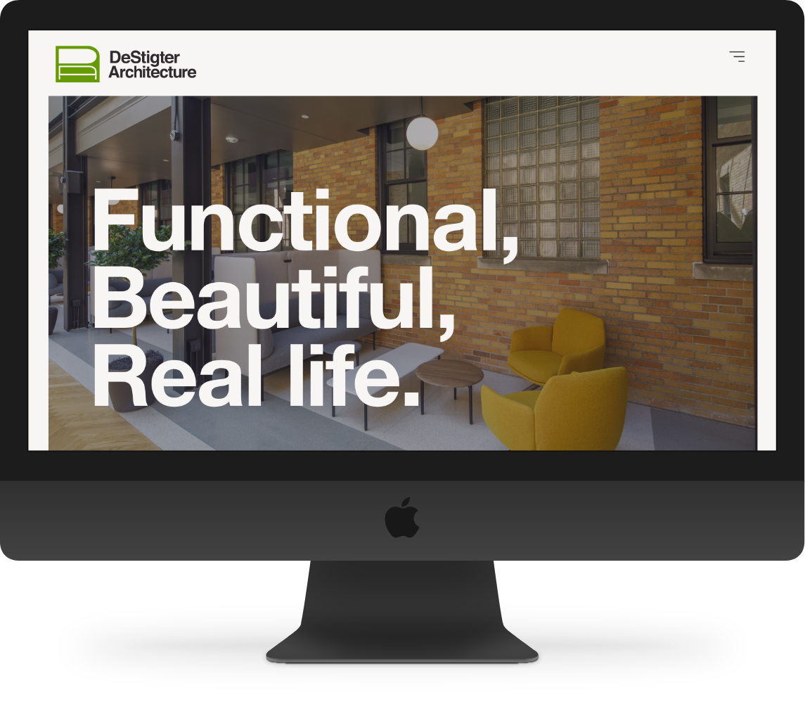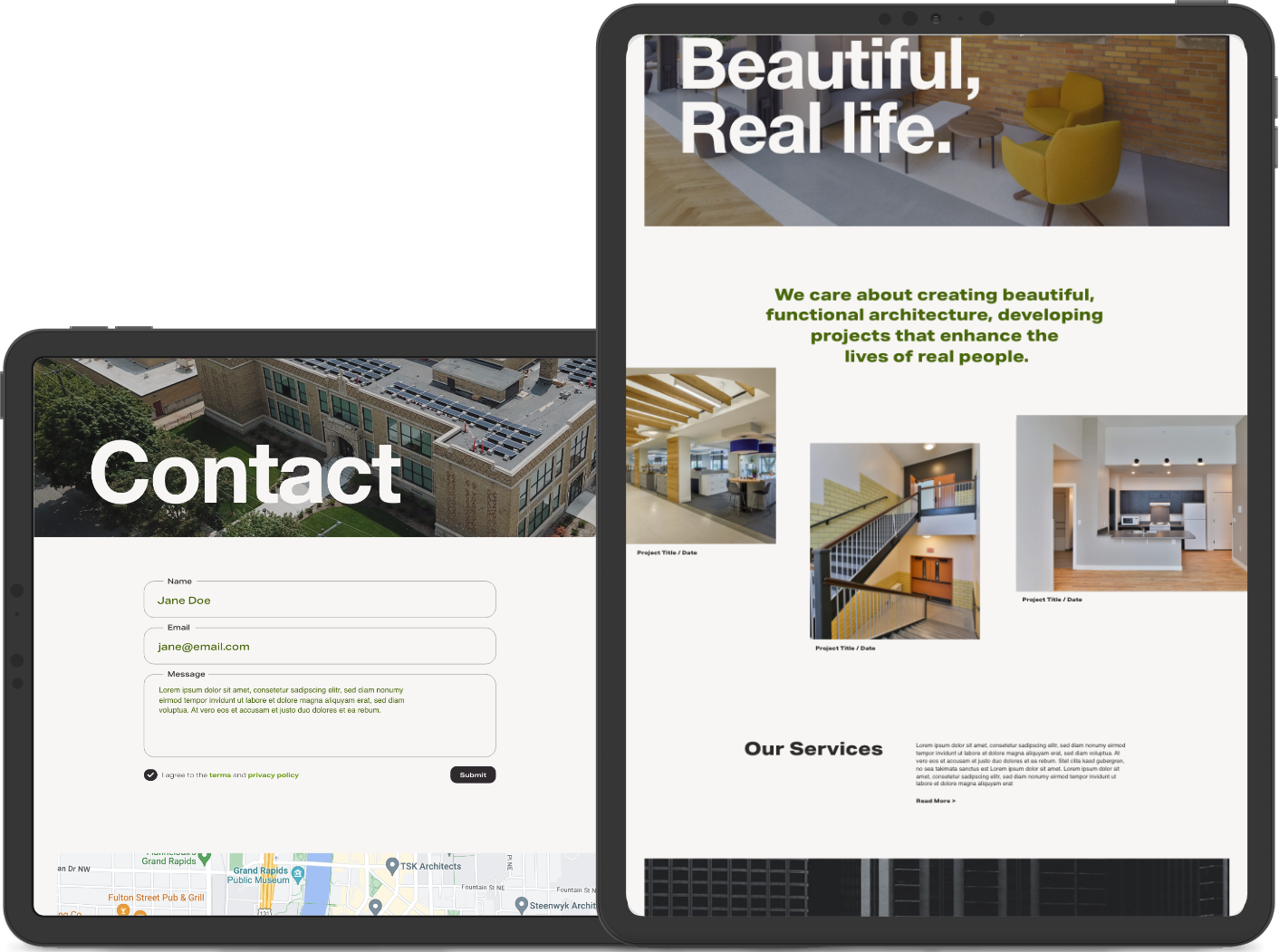
DeStigter Architecture has been in the architecture business for decades now in Grand Rapids. And while their work shines bright -- they came to us with an outdated logo, without an existing website, and with a hope for a new breath of life into their brand. After many meetings and workshops with their team, we delivered a new logo and website that were fresh, timeless and clean.
Services
- Web Design
- Development
- Design & Branding
Deliverables
- Custom website design
- WordPress theme
- Logo & color scheme


Art gallery who?
Taking inspiration from the work that DeStigter puts out, we wanted to create a long scroll interaction that mirrors an art gallery experience. Architecture is an age old form of fine, functional art--so looking through this website should be as equally as timeless and beautiful as it is practical and functional.
“Logos are the graphic extension of the internal realities of a company.”
- Saul Bass
Badge of Conduct
We knew that the new DeStigter logo needed to be a perfect little showcase of not just their brand personality, but the ideals it stands for as well. We moved the brand palette from a bright red (a color already used by a few other local architecture firms) to a fresh breath of green. Not only does it communicate to the user that the brand is known for their sustainable housing efforts, but also ensures that it's set apart from other brands in the area.
have a job for us?
Tell us more about your project and how we can help bring your ideas to life!